Insurance
Car Insurance
Auto insurance protects your finances from the unexpected. Use our car insurance tools to generate quotes, compare coverage options and find the best insurance company for you. Bankrate’s editorial team curated these top auto insurance picks for your budget.
Homeowners Insurance
If anything happens to your home or belongings, home insurance can protect you financially. Find out how much home insurance you need, how much you’ll pay, and what company is best for you with our online tools.
Life Insurance
Life insurance helps you financially care for your loved ones after you pass away. Bankrate is here to help you compare quotes and find the best life insurance company for you.
Insurance Basics
Latest Articles
-
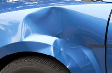
What to do after a hit-and-run in Georgia
Being involved in a Georgia hit-and-run may mean legal and financial consequences.
7 min read Apr 19, 2024 -

Minimum car insurance coverage requirements in each state
Bankrate takes a close look at minimum requirements for car insurance in each state.
10 min read Apr 19, 2024 -

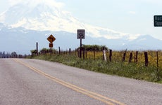
Penalties for driving without insurance in Oklahoma
Know the risks of driving without insurance in the Sooner State.
6 min read Apr 19, 2024 -
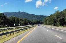
How a speeding ticket impacts your insurance in Washington
A speeding ticket in Washington State could increase your insurance by 21 percent.
7 min read Apr 19, 2024 -

What is a home insurance binder?
Do you need a home insurance binder? Find out with Bankrate.
5 min read Apr 19, 2024 -

U.S. gas prices in 2024: how much is gasoline in each state?
Current and historical gas price averages, where does your state rank?
6 min read Apr 19, 2024 -

What is umbrella insurance and how much does umbrella coverage cost?
Bankrate shows how umbrella insurance works for every phase of your financial life.
11 min read Apr 19, 2024 -

New Jersey DUI: laws and penalties for driving while intoxicated
Learn how driving under the influence impacts car insurance in New Jersey.
8 min read Apr 19, 2024 -

Drowsy driving statistics and facts 2024
Learn about drowsy driving statistics, effects and safety tips from Bankrate.
14 min read Apr 19, 2024 -
Penalties for driving without insurance in North Carolina
Driving without insurance in NC is illegal. Here are the penalties to be aware of.
6 min read Apr 18, 2024